Widget Selector Modal: Build XR Dashboards without the Guesswork


Build Custom XR Dashboards Faster With the New Widget Selector Modal
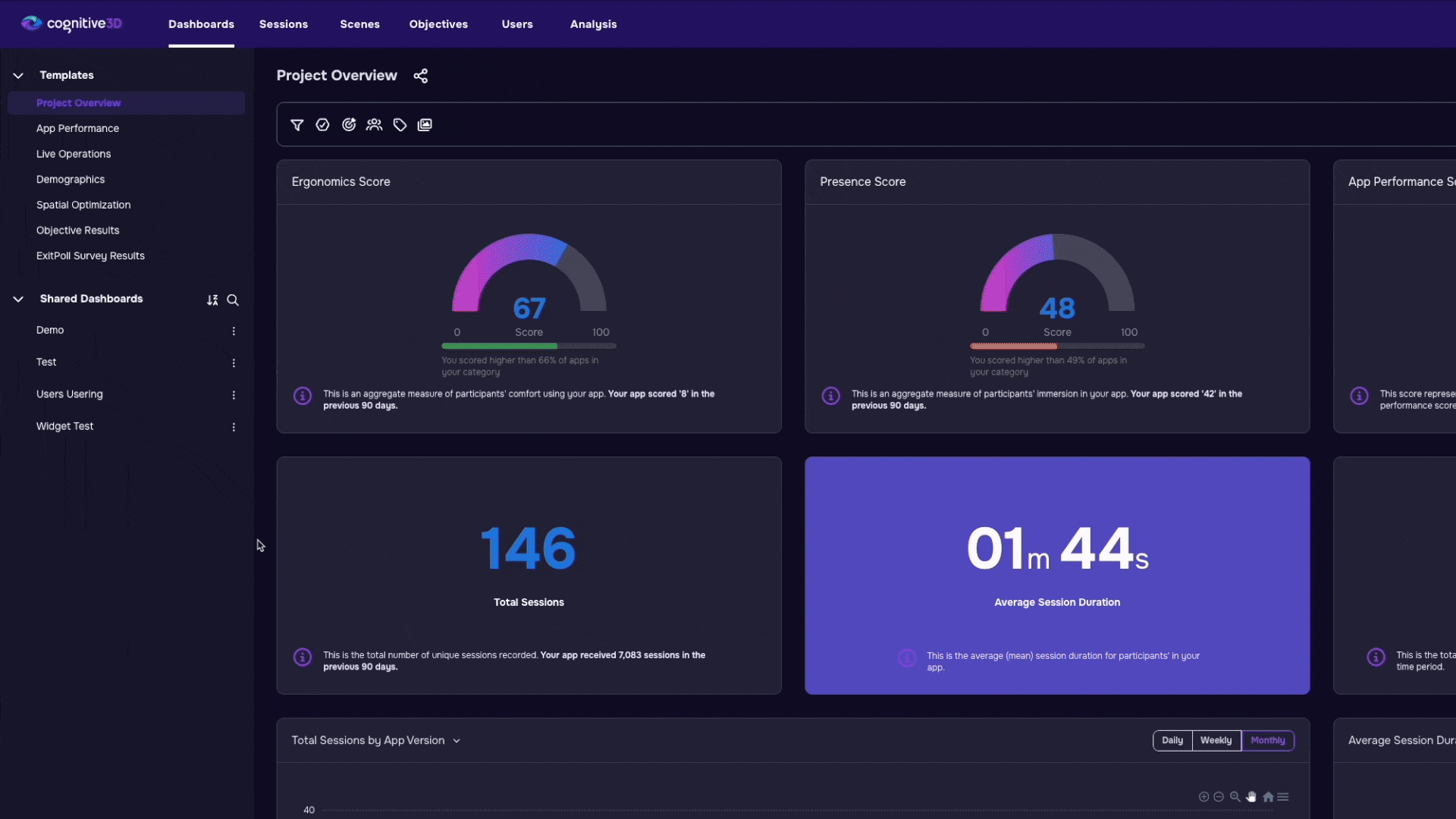
Custom dashboards are one of the most valuable ways to explore XR data in Cognitive3D. They help teams focus on the metrics, objectives, and behaviours that matter most for their specific use case.
Up until now, building those dashboards often required deep familiarity with the platform and the available widgets. Many teams relied on internal support to create dashboards that actually worked well together.
The new Widget Selector Modal changes that.
Instead of building dashboards one widget at a time from a simple dropdown list, users can now browse, preview, search, and assemble an entire dashboard in a single workflow.
The result is a faster, more approachable way to build dashboards that fit the questions your team is trying to answer.
What Was Missing From the Previous Workflow
The previous widget selector was functional, but it required users to already know exactly what they wanted.
Widgets were selected individually from a dropdown menu with little context around what they actually displayed or how they contributed to a dashboard. Users often had to add a widget first, place it on the dashboard, and then decide whether it was useful. If it was not the right fit, they had to remove it and repeat the process again.
That created friction for newer users and made dashboard creation feel more technical than exploratory. Instead of encouraging experimentation, the workflow rewarded familiarity with the platform and prior experience building dashboards.
In practice, many organizations depended on Cognitive3D staff to assemble dashboards for them because building a useful layout required platform familiarity and a significant amount of trial and error.
A Faster Way to Build Dashboards
The new Widget Selector Modal is designed to make dashboard creation more visual, flexible, and approachable.
Now, when users create or edit a dashboard, they can browse available widgets in a single interface and assemble a complete dashboard in one smooth sequence. Rather than interrupting the workflow every time a new widget is added, the experience keeps users focused on the dashboard they are trying to build as a whole.
This significantly reduces the time and effort required to create custom dashboards. Instead of repeatedly opening menus, testing widgets, and reorganizing layouts, users can move through the process much more naturally.
For many teams, dashboard setup that previously took several minutes can now happen in only a few seconds. More importantly, it lowers the barrier for users who may not have extensive experience with Cognitive3D analytics tools.
Explore Widgets by Category
Widgets are now grouped into categories, making it easier to build dashboards around a specific goal or workflow.
Previously, users needed to know the exact name of a widget before selecting it. The new categorized structure shifts the experience from memorization to discovery. Users can now browse widgets based on the type of insight they are trying to explore rather than relying on platform knowledge alone.
For example, teams can quickly focus on areas such as objective tracking, session analysis, engagement metrics, behavioural insights, or performance trends. This makes it easier to create dashboards that are aligned with a specific use case or stakeholder need.
This change also helps users think more strategically about how dashboards are structured. Instead of selecting widgets individually without context, users can build dashboards that feel cohesive and purpose-driven from the beginning.
Preview Widgets Before Adding Them
One of the biggest usability improvements is the ability to preview widgets before selecting them.
Users can now see what a widget looks like directly inside the selection flow, helping them understand how information will appear before anything is added to the dashboard. This gives users more confidence during the dashboard building process because they can immediately evaluate whether a widget supports the type of analysis they want to perform.
The preview experience also reduces unnecessary experimentation. Instead of adding multiple widgets simply to compare layouts or visuals, users can make more informed decisions up front.
For newer users especially, this creates a more intuitive introduction to the platform. The dashboard builder feels less like a technical configuration tool and more like a guided exploration of available XR analytics views.
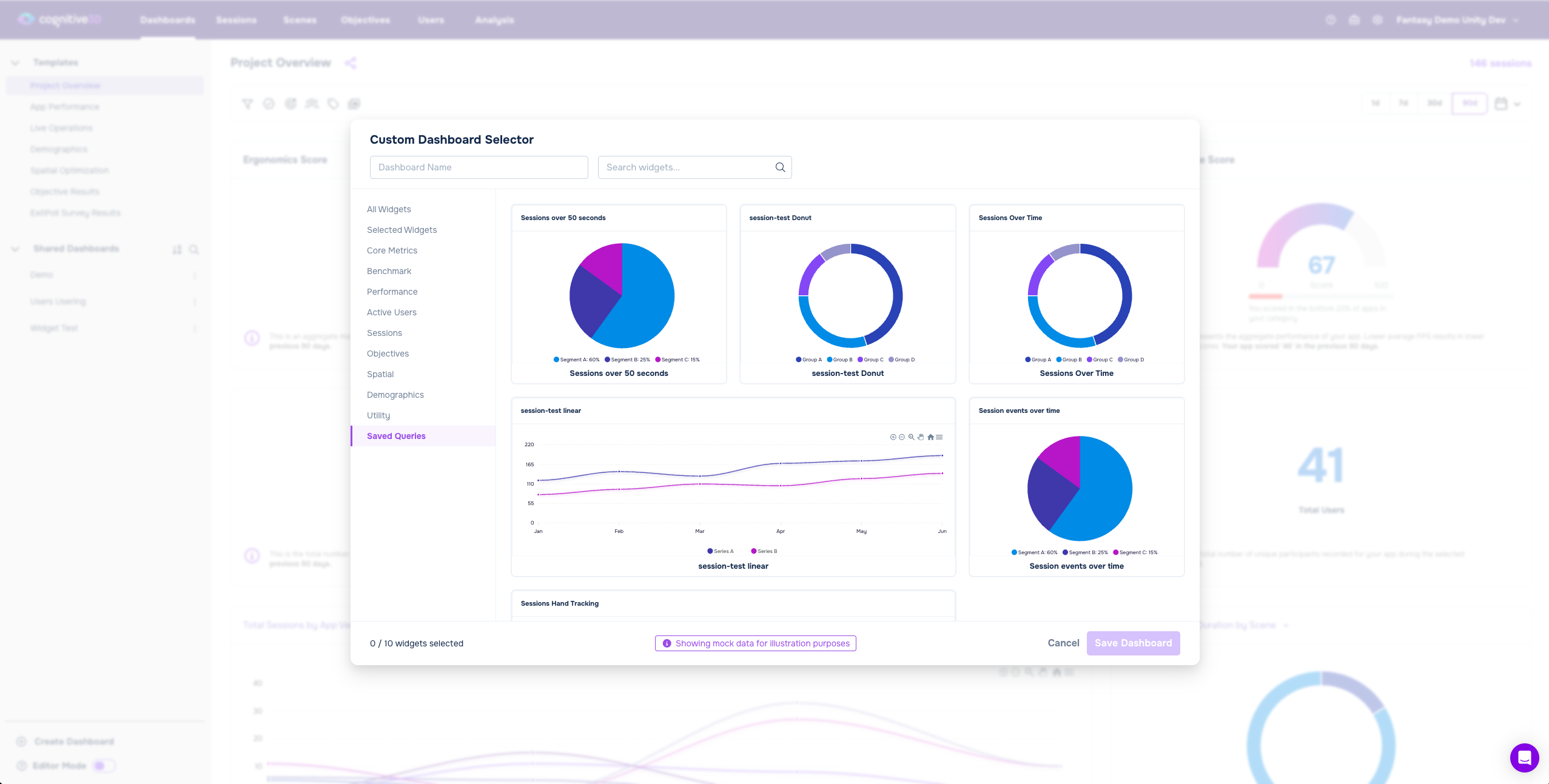
Search and Filter More Efficiently
As dashboard capabilities grow, discoverability becomes increasingly important.
The new Widget Selector Modal includes search and filtering tools that help users quickly narrow down available widgets and find what they need faster. This is particularly useful for organizations with larger projects or more advanced analytics workflows where dashboards may include many different types of metrics and visualizations.
Instead of scrolling through long lists of widget names, users can now focus on the specific information they are looking for. This improves both speed and usability while reducing frustration during dashboard creation.
The filtering experience also supports a wider variety of workflows across training analysis, research projects, gameplay analytics, operational monitoring, and stakeholder reporting. Different teams can quickly identify the widgets most relevant to their goals without needing deep platform expertise.
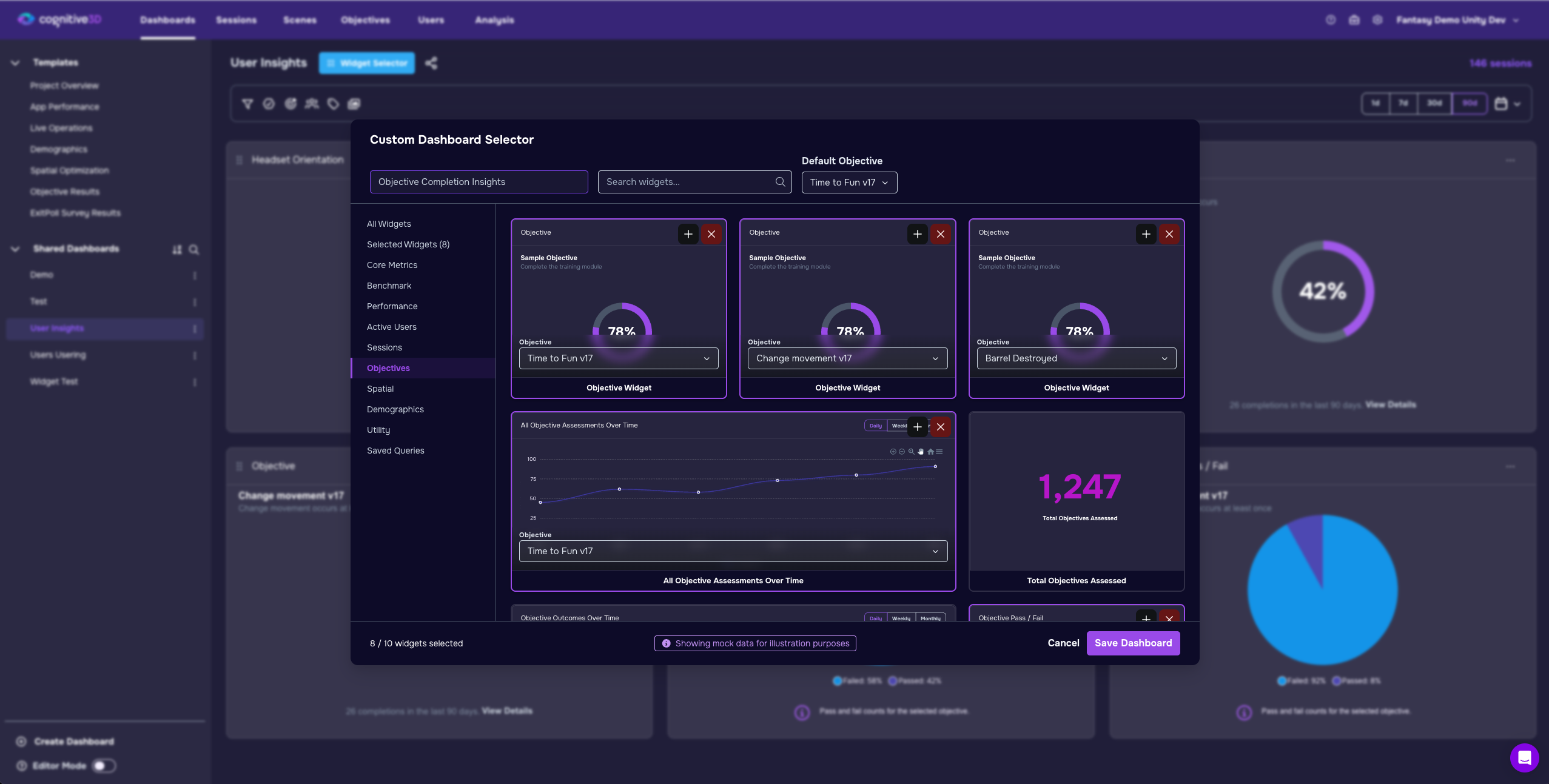
Build More Focused Dashboards With Duplicate Objective Widgets
Users can now add duplicate objective widgets to the same dashboard.
While this may sound like a small feature at first, it creates much more flexibility when building dashboards around specific objectives, scenarios, or KPIs. Teams are no longer limited to a single instance of a widget, which allows dashboards to support more detailed comparisons and more focused analysis.
For example, a training team might compare multiple learning objectives side by side within the same dashboard. Research teams can evaluate participant groups across different sessions or environments without needing to recreate the dashboard structure from scratch.
This flexibility makes dashboards more adaptable to real-world XR analysis workflows, where users often need to compare multiple data points simultaneously. Instead of forcing users into rigid dashboard structures, the new modal supports more customized and iterative approaches to analysis.
Lowering the Barrier to XR Data Exploration
The most important change is not just speed, it is accessibility.
The new Widget Selector Modal makes dashboard creation feel approachable instead of specialized. New users no longer need deep platform knowledge or prior experience to start building dashboards that are meaningful and useful.
Instead of relying on a Cognitive3D data expert to assemble dashboards manually, teams can now explore available insights visually and build dashboards independently. The interface encourages experimentation by making the process more transparent and forgiving.
This shift matters because dashboards are often the entry point into XR analytics. When dashboard creation feels complicated, many users avoid customization entirely. By simplifying the experience, Cognitive3D helps more teams engage directly with their data and build views tailored to their workflows.
The experience is designed to feel more intuitive from the very first click, helping users focus less on learning the interface and more on understanding what is happening inside their XR experiences.
Why This Matters
XR teams generate large amounts of behavioural and spatial data. But data only becomes useful when teams can organize it into views that support real decisions.
Dashboards are often where that interpretation happens. They allow teams to monitor objectives, compare sessions, identify friction points, and understand how users interact with immersive environments over time.
By making dashboard creation faster and easier, the new Widget Selector Modal helps teams spend less time configuring analytics and more time understanding learner performance, user behavior, engagement patterns, objective completion, and overall experience quality.
The update also changes how approachable analytics feels for non-technical users. Teams no longer need to rely on specialized support to create useful dashboards, which improves self-service adoption across organizations.
Ultimately, the feature turns dashboard building from a technical setup task into a more natural part of the XR analysis workflow.