Power BI XR Analytics: Putting Cognitive3D Data into Your Existing BI Workflows


Put XR Data Where Your Team Already Works
Most XR teams can answer what happened inside a single experience, but far fewer can explain what is happening across all of them.
As XR programs expand across training, simulation, and product environments, the questions naturally shift. Instead of focusing on individual sessions, teams need to understand performance at the organizational level. They need to know which experiences are underperforming, whether users remain comfortable across devices, where engagement drops off, and how XR activity connects to broader systems like LMS data or operational metrics.
Answering those questions requires more than project-level analytics. It requires a unified view of XR data across the organization.
That is the role of the new Power BI Organizational Dashboard for Cognitive3D.
From Project Insights to Organizational Visibility
Cognitive3D is built to provide deep visibility into individual XR experiences. Within a single project, teams can replay sessions, analyze behaviour, and evaluate performance with precision.
As organizations expand their XR programs, that foundation creates an opportunity to look beyond individual experiences and understand how everything performs together.
Program leaders are not only interested in what happened in one session. They need to understand patterns across an entire portfolio of experiences. This often involves comparing performance across projects, identifying trends over time, and connecting XR data to broader organizational systems.
In many cases, that analysis requires moving between projects or combining datasets externally. While the underlying data is already there, it has not always been easy to view it as a single, unified system.
At the same time, organizations are increasingly looking to connect XR data with other sources, such as training systems, participant data, and operational metrics. Bringing these datasets together creates a more complete picture of performance and impact.
This is the next step in the evolution of XR analytics: moving from deep project insight to clear organizational visibility.
Introducing the Power BI Organizational Dashboard
The Power BI XR analytics dashboard addresses this gap by shifting from project-level visibility to organizational insight.
Instead of treating each experience as a separate unit of analysis, the dashboard aggregates data across all projects into a single, unified system. This creates a complete operational view of XR performance, usage, and outcomes across the organization.
Importantly, this is not simply another interface inside Cognitive3D. The dashboard runs in Microsoft Fabric and Power BI within the customer’s own infrastructure. That means the data is no longer confined to a product UI. It becomes part of the organization’s broader data environment, where it can be analyzed, extended, and combined with other systems.
What You Can See Across Your XR Portfolio
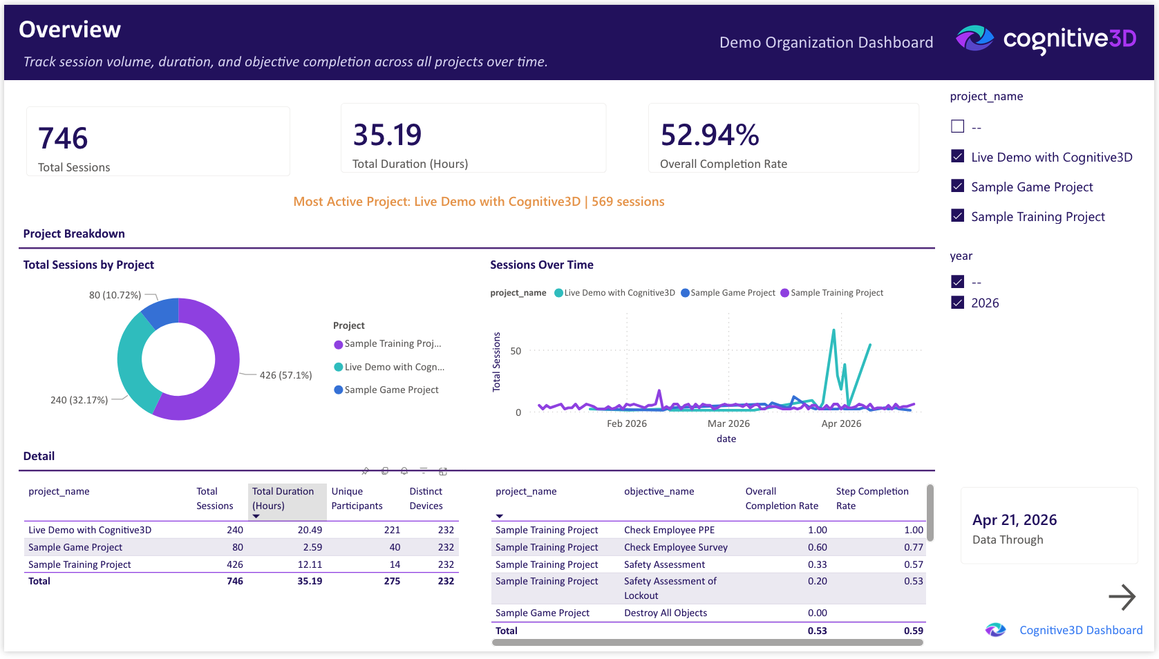
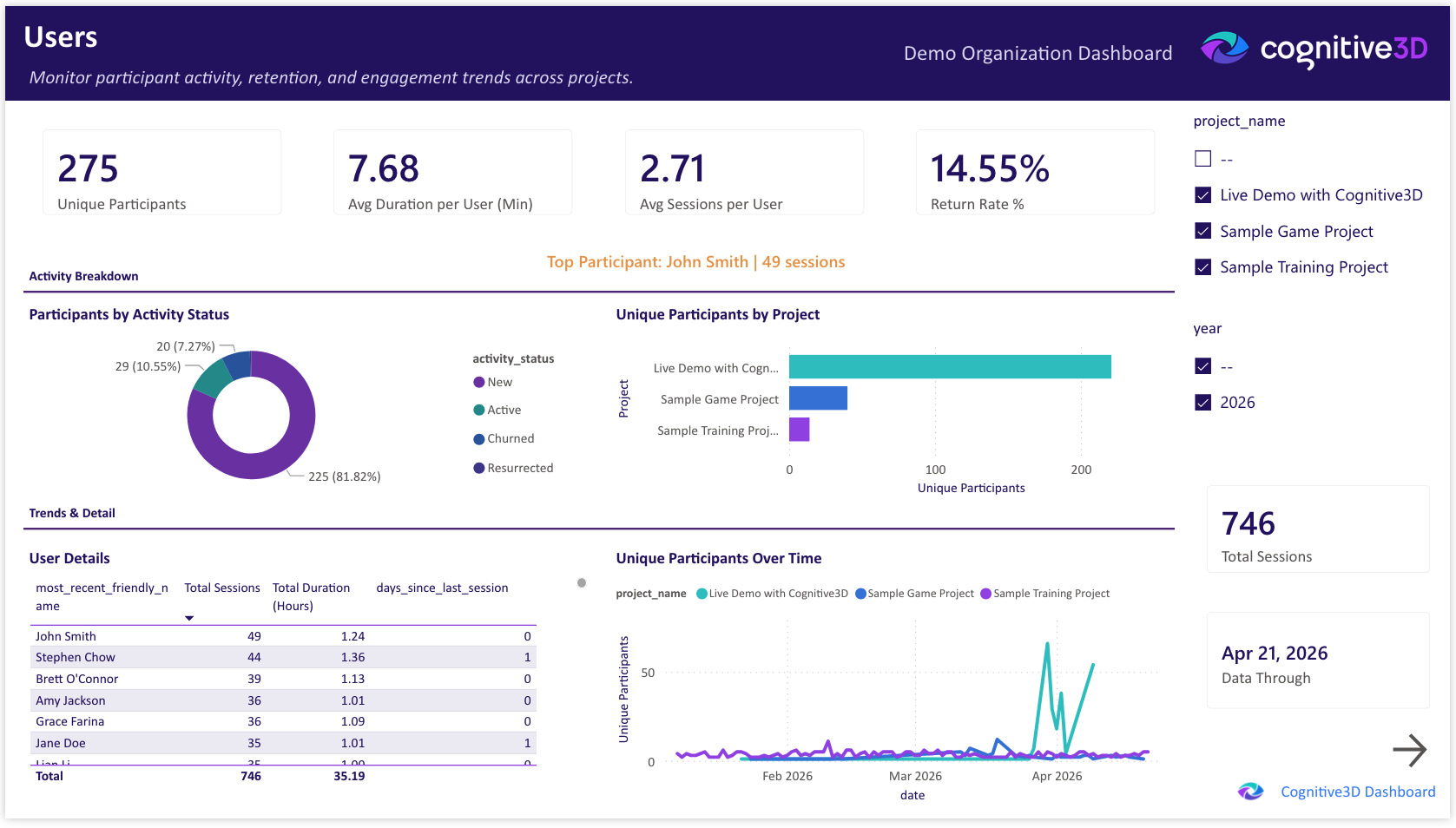
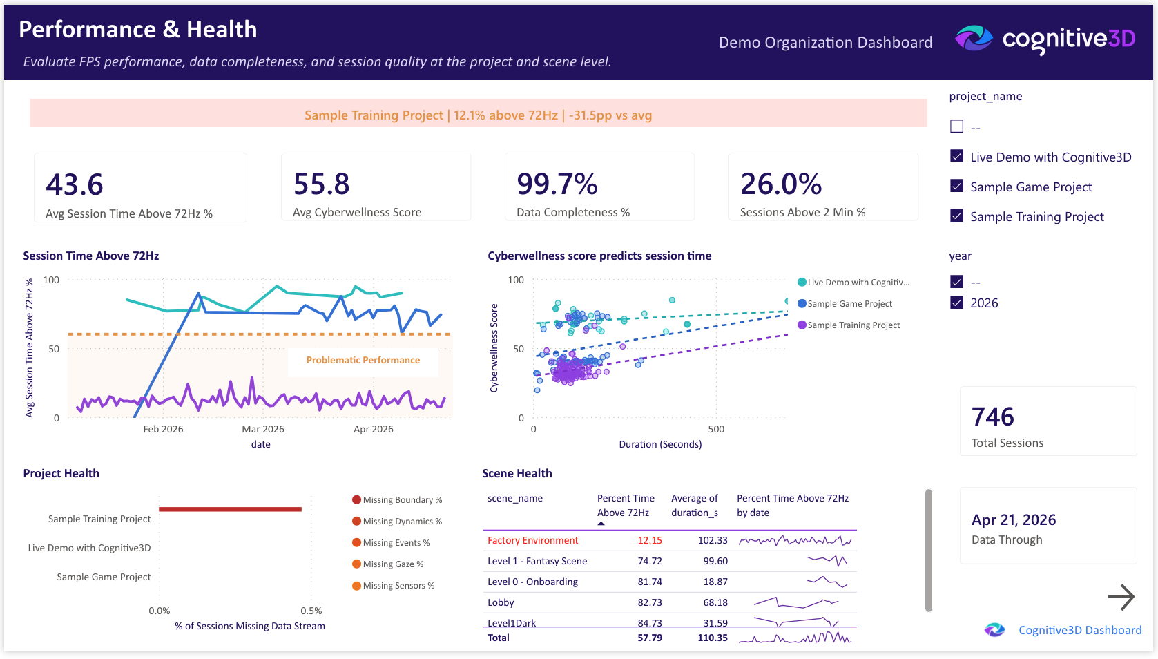
The dashboard is organized into seven views that reflect how teams actually evaluate performance across an XR program.
- Overview provides a high-level summary of performance and usage trends
- Users focuses on how individuals and groups engage with experiences over time
- Performance & Health surfaces system metrics such as frame rate and stability
- Objectives & Survey connects user behaviour to outcomes and feedback
- Devices shows which hardware is actively being used
- Map visualizes where sessions are taking place geographically
- Objective Detail drill through that enables deeper analysis of specific goals or steps
Together, these views replace fragmented analysis with a single system that allows leaders to move from question to answer without switching contexts.
Why Power BI and Microsoft Fabric Matter
The most significant shift is not the dashboard itself, but where the data resides.
By bringing Cognitive3D data into Microsoft Fabric and Power BI, XR analytics becomes part of the organization’s existing data ecosystem. This allows teams to work with XR data in the same way they work with other business data, rather than treating it as a separate stream.
In practical terms, this means XR data can be combined with LMS records, employee data, or operational metrics to create a more complete picture of performance. It also means teams can build custom reports, embed XR insights into existing dashboards, and use familiar tools to query and explore the data.
Instead of exporting and rebuilding datasets, teams can work directly within their established BI workflows. XR analytics becomes part of the system where decisions are already happening.
What Changes for Enterprise XR Teams
This shift changes how teams operate at a fundamental level.
First, visibility moves from individual projects to the entire portfolio. Leaders can quickly understand how experiences compare, identify where issues exist, and track how performance evolves over time. This makes prioritization more grounded and less dependent on manual investigation.
Second, decision-making becomes faster. Previously, identifying a poorly performing experience could require hours of comparison across projects. With an organizational view, those issues can be surfaced immediately, allowing teams to act without delay.
Finally, XR data becomes part of existing workflows. Most enterprise teams already rely on Power BI for reporting and analysis. By placing XR data in that environment, immersive analytics is no longer a separate activity. It becomes part of regular reporting cycles, executive reviews, and operational discussions.
New Insights You Couldn’t See Before
When XR data is unified at the organizational level, new patterns begin to emerge.
Teams can see how individual experiences compare to the organizational average, making it easier to identify outliers that require attention. They can observe trends in user comfort across devices and environments, and track engagement in a way that reflects meaningful participation rather than isolated sessions.
Just as importantly, they can identify gaps in the data itself. Inconsistent instrumentation or incomplete datasets become visible at the portfolio level, allowing teams to improve data quality over time.
These insights are not simply more data points. They represent relationships between datasets that were previously disconnected, enabling a more complete understanding of how XR programs are performing.
How the Power BI XR Analytics Pipeline Works
The dashboard is powered by a data pipeline that brings session-level data from Cognitive3D into the customer’s Power BI environment.
This creates a structured dataset that supports flexible querying and integration with other systems. Because the data exists within a relational BI environment, teams can perform more complex analysis than would be possible within a project-scoped analytics tool.
The current implementation focuses on session-level data rather than full spatial datasets. This is a deliberate design choice that keeps infrastructure requirements manageable while still supporting meaningful organizational analysis.
The White-Glove Deployment Model
The Organizational Dashboard is delivered through two proven deployment patterns that form the starting point for every engagement. Each is designed to integrate with the Power BI or Fabric environment a customer already runs, and both leave Cognitive3D responsible for the data pipeline, encompassing ingestion, aggregation, and the derived user, device, and metric tables that power the dashboard. Customers take on the dashboard inside their own tenant, while we keep the data engineering behind it.
- Custom Power BI Connector (.mez). For customers who want to point Power BI at their Cognitive3D data today using Pro, PPU, Premium, or Fabric. The customer installs our C3D-branded connector in Power BI Desktop, authenticates with a scoped org API key, and refreshes on whatever schedule their license allows. No warehouse, no gateway, no Fabric capacity required. License-agnostic and productized.
- Shared-storage delivery (ADLS Gen2 / OneLake). For enterprise customers on Fabric or Power BI Premium who want the full org dashboard experience. Cognitive3D runs the ingestion and transformation pipeline on our side, including the derived user, device, and metric tables, and writes refined datasets to a shared storage container. The customer's workspace reads the container natively via Fabric's built-in connectors and applies our report template. This is the same Import-mode pattern that powers our public demo, extended across a tenant boundary.
From either starting point, each deployment is configured to align with the customer's existing data systems, reporting requirements, and organizational structure. The dashboard shown in this post serves as a reference point, but it can be adapted to fit specific use cases and workflows. This approach ensures that the solution integrates cleanly into enterprise environments, rather than forcing teams to adapt to a rigid, predefined model.
How to pick: the connector is the fastest path if you just want Cognitive3D data in Power BI today. Shared-storage delivery is the right fit when you want the full branded dashboard inside your own tenant with your own governance, and you're already invested in Fabric or Power BI Premium.
How we build it: the report and pipeline are versioned in Git with CI validation on every change, so every deployment is reproducible and auditable.
Explore the Power BI Dashboard for Cognitive3D
We are previewing what enterprise XR analytics looks like when Cognitive3D data becomes part of your BI ecosystem.
If you want to see how this would work within your organization, you can book a demo or connect directly with our Data Science team.